The Coronavirus pandemic has completely dominated the news cycle around the globe and has resulted in the suspension and cancellation of many high profile events, including the NBA, MLB, NHL, PGA, Broadway, schools, churches, and more.
News that puts God FIRST. Sign up for our FREE YouTube Channel HERE.
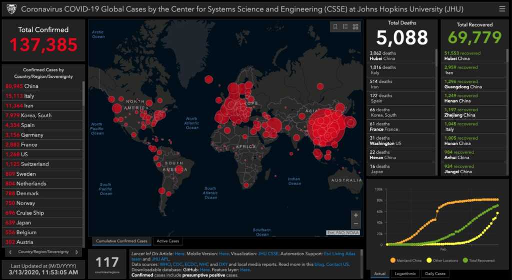
There’s a lot of information to keep up with, and Johns Hopkins University’s Center for Systems Science and Engineering created a tool to help people and healthcare officials keep up with the very latest.
Click on the image to visit the live heat map:

The data is updated frequently throughout the day, with the latest update being seen in the lower lefthand corner of the map.
According to Johns Hopkins, they are pulling the most recent data from all of the leading organizations tracking the illness:
The data sources include the World Health Organization, the U.S. Centers for Disease Control and Prevention, the European Center for Disease Prevention and Control, the National Health Commission of the People’s Republic of China, local media reports, local health departments, and the DXY, one of the world’s largest online communities for physicians, health care professionals, pharmacies and facilities.
It’s particularly helpful to watch the numbers directly, as there are many misleading facts being presented on various news channels. The temptation to make politics out of this issue has proven too tempting for many, so sticking to the raw data is a great first step towards being informed and making rational decisions.
For more information on COVID-19, GET YOUR FREE FACTSHEET: Coronavirus: What You Need to Know
Stay tuned to Faithwire & CBN News for updates you can trust on the Coronavirus pandemic.


